As you already know, statistics is all about reading patterns in numbers. As you can imagine, one of the easiest ways to read patterns is to actually look at a graph of the data. I case you don’t know, the most common type of statistical graph is a histogram.
Take a look at the best statistics calculators.
What Is A Histogram?
Simply put, a histogram is just a graph of frequency. So, as you can easily understand, it shows how frequently certain values occur in the data.
Besides the fact that it’s pretty easy to make a histogram, it can also be used to show the frequency of any type of variable.
Above, you can see a simple example of a histogram. So, the first thing you need to notice is the labels.
When you are looking at a good histogram, you should be able to see 3 different labels: the tile, the y-axis which is always labeled frequency because that is what a histogram shows, and the x-axis that should be labeled telling the reader what variable is being measured.
Discover what is sampling variability and why it is important.
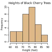
If you check the example above, you can see that this histogram is about the height of black cherry trees. The x-axis tells you the range of heights that were measured and the y-axis tells how frequent each range of data is.
The second thing you need to look at in a histogram is the bars.
Simply out, histograms are made with bars instead of lines or data points. It’s important to keep in mind that the bars should be in contact with each other unless there is a gap in the data.
In the case of our example, you can see that all the black cherry trees measure between 65 and 90 feet, with the most frequent measurement being between 75 and 80 feet.
The third aspect to look at in any histogram is scales.
Discover more about time series analysis and forecasting.
The scale on the y-axis starts at zero and should go to the highest frequency in the data. In our case, the most frequent measurement is 75-80 with 10 measurements, so that is the top of our scale. Along the x-axis, you should always start at your smallest value and then go to your highest value. In our case, the smallest tree was 60-65 feet and the tallest was 85-90, so that is the range.
Notice that in this example, the scale is in 5-ft increments. However, you could have made an individual bar for each foot measure, but it would be a lot of work to achieve the same overall effect.
Discover more about hypothesis testing for newbies.
Building A Histogram
While reading a histogram is easy, building one is as easy. However, we want to show you exactly how to build your own.
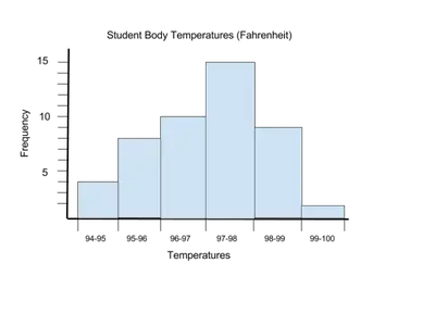
Let’s say that you had a group of people who measured their temperatures.
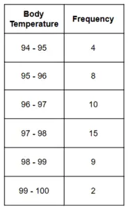
Just by looking at the data above, you should be able to see that the most frequent measurements are between 97 and 98, which is the average body temperature. So, this should be the tallest bar of your histogram. You can also see that the highest frequency is 15, so that will be the maximum of your y-axis. The data table is broken into chunks that you will use for your scale on the x-axis. So, your skeleton graph should look like this:

Now, it’s time to add the bars. Remember that bars need to touch each other.