Category : Blog

Chi-Square Test Of Independence Rule Of Thumb: n > 5

Rules of thumb tend to b used sometimes in statistics. However, it is also important to keep in mind that if there is a rule of thumb, it also means that it may be misleading, misinterpreted, or simply wrong. 

Discover the best online stats calculators.

Chi-square-test

One of the rules of thumb that keeps getting distorted along the way regards the Chi-square test. You probably already heard that “The Chi-Square test is invalid if we have fewer than 5 observations in a cell”. However, this statement is not even accurate. If you are trying to say something similar to this, then you need to say that it’s the expected count that needs to be >5 per cell and not the observed in each cell. 

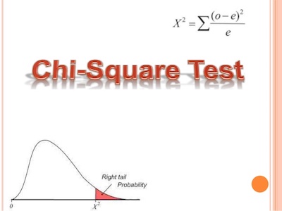
Remembering The Chi-Square Test

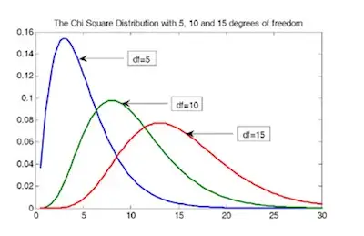
As you probably already know, the Chi-square statistic follows a chi-square distribution asymptotically with df=n-1. This means that you can use the chi-square distribution to calculate an accurate p-value only for large samples. When you are working with small samples, it doesn’t work.

Remembering-The-Chi-Square-Test

The Size Of The Sample

Now, you’re probably wondering about how large the sample needs to be. We can then state that it needs to be large enough that the expected value for each cell is at least 5. 

Understanding the The Chi-Square Goodness Of Fit Test.

The expected values come from the total sample size and the corresponding total frequencies of each row and column. So, if any row or column totals in your contingency table are small, or together are relatively small, you’ll have an expected value that’s too low.

Just take a look at the table below, which shows observed counts between two categorical variables, A and B. The observed counts are the actual data. You can see that out of a total sample size of 48, 28 are in the B1 category and 20 are in the B2 category.

Likewise, 33 are in the A1 category and 15 are in the A2 category. Inside the box are the individual cells, which give the counts for each combination of the two A categories and two B categories.

Take a look at a reliable tool for Chi Square test online.

The-Size-Of-The-Sample

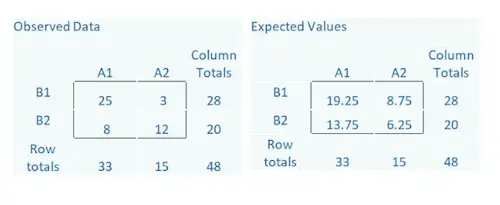
The Expected counts come from the row totals, column totals, and the overall total, 48. 

For example, in the A2, B1 cell, we expect a count of 8.75. It is an easy calculation: (Row Total * Column Total)/Total. So (28*15)/48.

The more different the observed and expected counts are from each other, the larger the chi-square statistic.

Notice in the Observed Data there is a cell with a count of 3. But the expected counts are all >5. If the expected counts are less than 5 then a different test should be used such as the Fisher’s Exact Test.

Check out these 5 steps to calculate sample size.

Is It 5 The Real Minimum?

The truth is that other authors have suggested guidelines as well:

  • All expected counts should be 10 or greater. If < 10, but >=5, Yates’ Correction for continuity should be applied.
  • Fisher’s Exact and Yates Correction are too conservative and propose alternative tests depending on the study design.
  • For tables larger than 2 x 2 “No more than 20% of the expected counts should be less than 5 and all individual expected counts should be greater or equal to 1. Some expected counts can be <5, provided none <1, and 80% of the expected counts should be equal to or greater than 5.
  • The Minitab manual criteria are: If either variable has only 2 or 3 categories, then either:

— all cells must have expected counts of at least 3 or

— all cells must have expected counts of at least 2 and 50% or fewer have expected counts below 5

If both variables have 4 to 6 levels then either:

— all cells have expected counts of at least 2, or

— all cells have expected counts of at least 1 and 50% or fewer cells have expected counts of < 5.


Understanding: Take An Interaction Out Of A Model

Whenever you are building a model, one of the most important decisions you need to make is related to which interaction terms you should include. 

As a rule of thumb, the default in regression is to leave them out. So, this means that you should only add an interaction with a solid reason. If you try to add all possible interactions, it will seem that you are simply data fishing. However, the truth is that this is a very common practice in ANOVA models. Most people simply add all interactions that are possible and only take them out when there is a solid reason. 

take-an-interaction-out-of-a-model-1

Discover all the stat calculators you need online.

While we believe that our approach is better, we’re not actually discussing that in this article. Instead, the main goal is to explain what it really means when an interaction is or is not in a model. 

Understanding: Take An Interaction Out Of A Model

In order to fully understand, we believe that there’s nothing better than an example. 

Imagine that you have a model of the height of a shrub (Height) based on the amount of bacteria in the soil (Bacteria) and whether the shrub is located in partial or full sun (Sun).

While height is measured in cm; bacteria is measured in thousand per ml of soil, and sun = 0 if the plant is in partial sun, and sun = 1 if the plant is in full sun.

Discover how to calculate sample size.

Here’s the model without an interaction term: 

Height = 42 + 2.3*Bacteria + 11*Sun

model-without-an-interaction-term-1

And here is the model with one: 

Height = 35 + 1.2*Bacteria + 9*Sun + 3.2*Bacteria*Sun

model-with-one-1

Understanding mean imputation.

If you take a closer look at the two previous images, you can easily withdraw some conclusions:

1. Adding the interaction allows the effect (slope) of Bacteria to differ in the two Sun conditions.

2. It also allows the effect (mean difference) in the Sun condition (the height of the orange lines) to differ at different values of Bacteria.

3. The interaction coefficient itself (3.2) estimates this difference in effect for one predictor, depending on the value of the other.

If it turns out that the best estimate of the interaction coefficient was zero, not 3.2, then the bottom graph would have looked like the top one.

But there is also a counter-intuitive part. 

When you include an interaction in a model, you’re estimating that coefficient from the data. Sometimes the estimate will be zero, or very close to zero, and sometimes not.

When you don’t specify an interaction term, the difference in effects doesn’t just go away. That difference always exists. However, when you don’t specify it, you are simply setting it to zero.

Check out how cloud computing can benefit data science.  [ https://statcalculators.com/how-cloud-computing-can-benefit-data-science ]

This is, incidentally, the same issue with removing an intercept from a model, when it theoretically should be zero or is not statistically different from zero.

In the case of the intercept, the general consensus is removing it will lead to unacceptable bias and poor fit. It’s a rare situation where removal is worthwhile.

Technically, the same is true for interactions, but they are generally held to a different standard. Why? The first reason is the fact that interactions are usually more exploratory and the second reason is that they also add more complexity to a model.

As with all issues of model complexity, sometimes the better coefficient estimates and model fit are worth it and sometimes they aren’t. Whether the complexity is worth it depends on the hypotheses, the sample size, and the purpose of the model.


5 Steps For Calculating Sample Size

There’s no question that you need to keep many things in mind when you are looking to conduct a study or research. However, one of the most important factors to always consider is related to data especially data size. 

In case you are wondering why this happens, it is fairly easy to understand. After all, undersized studies can’t find real results, and oversized studies find even insubstantial ones. We can then state that both undersized and oversized studies waste time, energy, and money; the former by using resources without finding results, and the latter by using more resources than necessary. Both expose an unnecessary number of participants to experimental risks.

calculating-sample-size

Discover all the statistics calculators you need.

So, the trick is to size a study so that it is just large enough to detect an effect of scientific importance. If your effect turns out to be bigger, so much the better. But first, you need to gather some information about on which to base the estimates.

As soon as you’ve gathered that information, you can calculate by hand using a formula found in many textbooks, use one of many specialized software packages, or hand it over to a statistician, depending on the complexity of the analysis. But regardless of which way you or your statistician calculates it, you need to first do 5 steps.

Understanding the 2 problems with mean imputation when data is missing. 

5 Steps For Calculating Sample Size

Calculating-Sample-Size-Steps

Step #1: Determine The Hypothesis Test:

The first step in calculating sample size is to determine the hypothesis test. While most studies have many hypotheses, in what concerns calculating sample size, you should only pick up to 3 main hypotheses. Make them explicit in terms of a null and alternative hypothesis.

Step #2: Specify The Significance Level Of The Test:

While the significance level assumed is, in most cases, 0.5, it doesn’t need to be. 

Understanding measurement invariance and multiple group analysis.

Step #3: Determine The Smallest Effect Size That Is Of Scientific Interest:

For most, this is the most difficult aspect of what concerns calculating sample size. The truth is that the main goal isn’t to specify the effect size that you expect to find or that others have found, but to determine the smallest effect size of scientific interest. This means that you are looking for variables that actually affect the results or outcomes. 

Here are some examples:

  • If your therapy lowered anxiety by 3%, would it actually improve a patient’s life? How big would the drop have to be?
  • If response times to the stimulus in the experimental condition were 40 ms faster than in the control condition, does that mean anything? Is a 40 ms difference meaningful? Is 20? 100?
  • If 4 fewer beetles were found per plant with the treatment than with the control, would that really affect the plant? Can 4 more beetles destroy, or even stunt a plant, or does it require 10? 20?

Check out how cloud computing can benefit data science.

Step #4: Estimate The Values Of Other Parameters Necessary To Compute The Power Function:

sample-size

If you have been studying statistics for some time, then you know that most statistical tests have the format of effect/standard error. 

We’ve chosen a value for the effect in step #3. The standard error is generally the standard deviation/n. To solve for n, which is the point of all this, we need a value for standard deviation. 

Step #5: Specify The Intended Power Of The Test:

The final step to calculating sample size is to specify the intended power of the test. 

Simply put, the power of a test is just the probability of finding significance if the alternative hypothesis is true.

As you can understand, a power of 0.8 is the minimum. If it will be difficult to rerun the study or add a few more participants. On the other hand, a power of 0.9 is better. If you are applying for a grant, a power of 0.9 is always better.


Factor Analysis – How Big Your Sample Size Needs To Be?

When you are looking to conduct a study, you usually plan a sample size for a data set. This is based on getting reasonable statistical power to ensure that you can run a good analysis. These power calculations figure out how big a sample you need so that a certain width of a confidence interval or p-value will coincide with a scientifically meaningful effect size.

factor-analysis

But that’s not the only issue in sample size, and not every statistical analysis uses p-values. One example is factor analysis.

Discover the best stat calculators here.

What Is Factor Analysis?

Simply put, factor analysis is a measurement model of an underlying construct. Ultimately, the focus is on understanding the structure of the relationships among variables.

what-is-factor-analysis

The specific focus in factor analysis is understanding which variables are associated with which latent constructs. The approach is slightly different if you’re running an exploratory or a confirmatory model, but this overall focus is the same.

So, how big does your sample need to be in factor analysis? Simply put, big. However, the answer isn’t that simple in what comes to statistics. 

Check out our student t value calculator.

The Rules Of Thumb

The truth is that this is a discussion between authors. For example, some authors use a criterion based on the total sample size:

  • 100 subjects = sufficient if clear structure; more is better
  • 100 subjects= poor; 300 = good; 1000+ = excellent
  • 300 subjects, though fewer works if correlations are high among variables.

Looking for a p-value calculator for a student t-test?

Other authors base it on a ratio of the number of cases to the number of variables involved in the factor analysis:

  • 10-15 subjects per variable
  • 10 subjects per variable
  • 5 subjects per variable or 100 subjects, whichever is larger
  • 2 subjects per variable

And then others base it on a ratio of cases to the number of factors:

20 subjects per factor.

Remember That Rules Of Thumb Are Not Rules

reducing-data

While there are rules of thumb in what concerns factor analysis, the reality is that these aren’t rules. Some recent simulation studies have found that the required sample size depends on a number of issues in the data and in the model, working together. 

Learn to determine the t statistic and the degrees of freedom with our calculator.

They include all the issues listed above and a few more:

  • You’re going to need a large sample. That means in the hundreds of cases. More is better.
  • You can get away with fewer observations if the data are well-behaved. If there are no missing data and each variable highly loads on a single factor and not others, you won’t need as many cases. But counting on the data behaving is like counting on the weather behaving during hurricane season. You’ll have a better outcome most of the time if you plan for the worst.
  • The main issue with small data sets is overfitting (a secondary issue is if the sample is really small, the model won’t even converge). It’s a simple concept: when a sample is too small, you can get what looks like good results, but you can’t replicate those results in another sample from the same population.

All the parameter estimates are so customized to this particular sample, that they’re not useful for any other sample. This can, and does, happen in any model, not just factor analysis.


Missing Data: 2 Big Problems With Mean Imputation

While it may be simple at first sight, the truth is that mean imputation can be dangerous. 

The truth is that mean imputation is a very popular solution to deal with missing data. While it comes with many obstacles, the main reason why we stick to his solution is that it is easy. However, you need to keep in mind that there are many other alternatives to mean imputation that can deliver more accurate estimates and standard errors. 

missing-data

Check out all the stats calculators you need.

What Is Mean Imputation?

Simply put, man imputation is just the replacement of a missing observation with the mean of the non-missing observations for that specific variable. 

The Problems With Mean Imputation

#1: Mean Imputation Doesn’t Preserve The Relationships Among Variables:

If you think about it, imputing the mean preserves the mean of the observed data. So, when you have data that is missing completely at random, the estimate of the mean remains unbiased. And this is a good thing. 

In addition, when you input the mean, you can keep your sample size up to the full sample size. And this is also a good thing. 

How to deal with missing data in statistics?

So, we can then state that if you are only estimating means (which rarely happens), and if the data are missing completely at random, mean imputation will not bias your parameter estimate.

Since most research studies are interested in the relationship among variables, mean imputation is not a good solution. The following graph illustrates this well:

problem-1

This graph shows hypothetical data between X=years of education and Y=annual income in thousands with n=50.

The blue circles are the original data, and the solid blue line indicates the best fit regression line for the full data set. 

The correlation between X and Y is r = .53.

We randomly deleted 12 observations of income (Y) and substituted the mean. The red dots are the mean-imputed data.

Learning the generative and analytical models for data analysis.

Blue circles with red dots inside them represent non-missing data. Empty Blue circles represent the missing data. 

So, if you look across the graph at Y = 39, you will see a row of red dots without blue circles. These represent imputed values.

The dotted red line is the new best fit regression line with the imputed data. As you can see, it is less steep than the original line. Adding in those red dots pulled it down.

The new correlation is r = 0.39. That’s a lot smaller than 0.53.

The real relationship is quite underestimated.

Of course, in a real data set, you wouldn’t notice so easily the bias you’re introducing. This is one of those situations when you are trying to solve the lowered sample size, but you create a bigger problem.

Looking at OLS (Ordinary Least Squares) assumptions.

#2: Mean Imputation Leads To An Underestimate Of Standard Errors:

problem-2

You need to know that any statistic that uses the imputed data will have a standard error that’s too low. So, you may get the same mean from mean-imputed data that you would have gotten without the imputations. And yes, there are circumstances where that mean is unbiased. Even so, the standard error of that mean will be too small.

Because the imputations are themselves estimates, there is some error associated with them. But your statistical software doesn’t know that. It treats it as real data.

Ultimately, because your standard errors are too low, so are your p-values. Now you’re making Type I errors without realizing it.

That’s not good.


Measurement Invariance And Multiple Group Analysis

When you are looking to create a quality scale for a variable that cannot be directly measured with one variable is not simple. In fact, it requires multiple steps. So, in these cases, you will need to use Structural Equation Modeling. 

Notice that when creating scales is making sure the scale measures the latent construct equally well and the same way for different groups of individuals. Here’s a simple example: does your scale measure anxiety equally well for adults, adolescents, and children? Or does your scale measure assertiveness the same way for men and women?

Discover the best statistics calculators online.

When a scale measures a construct the same for different groups, this is called measurement invariance. However, it is important to keep in mind that you can’t just assume measurement invariance – you have to test it.

Testing For Measurement Invariance

When you are looking to test measurement invariance, you need to know that you can use 2 different methods: multiple group analysis and a simpler approach known as CFA with covariates. Today, we will only focus on the first one.

Multiple group analysis allows you to compare loadings, intercepts, and error terms in the groups’ measurement models. So, when you want to have a strong invariance, you need to show equal loadings of variables onto the latent variable and equal intercepts between groups. 

Learn how cloud computing can benefit data science.

Here’s the comparison between groups:

measurement-invariance

So, how can you determine the construct is measured consistently across groups? 

As we mentioned above, you need to follow multiple steps:

Step #1: Rerun the Exploratory Factor Analysis (EFA) model separately for both groups.

In case you have different indicator variables load onto the constructs across groups, you can stop right there. The construct is inconsistent across groups. This is known as testing for dimensional invariance.

Step #2: Run a single model in which the two groups each have their own measurement model.

The indicators will be the same for each group, but you allow the software to estimate the loadings and intercepts uniquely for each group.

The loadings and intercepts will rarely be the same for both groups. But the question is, are they similar enough to be considered statistically the same?

Here are the estimated loadings and intercepts for the male and female measurement models (configural model):

configural-model

Check out the 5 steps to take to collect high-quality data.

While they are not identical, you need to determine if they are close enough. 

If you refit the model with the 2 groups but you force the factor loadings to be equal across groups, and allow the intercepts to be unequal – you are using the metric model.

metric-model

Now, you can already see that while the loadings between males and females are the same, the intercepts are still different. 

Step #3: Fit the model with the factor loadings and intercepts equal across all groups (scalar model).

scalar-model

You should now take the difference between the metric and the scalar chi square model estimates again.

Understanding the F distribution.

In case the chi-square difference between the metric and scalar models is insignificant, we have group invariance. The change in chi-square above is 10.382, 5 degrees of freedom, p-value 0.065.

If you have group invariance, you know the construct is being measured the same across groups. You can then compare the differences between groups in a path analysis.


How Cloud Computing Can Benefit Data Science

While we can definitely state that the Internet changed a lot of our lives (for both people and businesses), we can’t exclude cloud computing. 

When you are studying statistics, you know that technology is crucial. After all, dealing with so many different types of data and running advanced models can’t be done manually. 

Discover the best online statistics calculators.

cloud-computing

The reality is that cloud computing enhanced, even more, the use of technologies especially in what is related to data science. After all, it offers numerous benefits without paying any additional cost or making new investments in hardware and infrastructure. 

The reality is that companies today generate vast volumes of data and to drive insights out of this data, they need to inevitably leverage data analytics. Simply put, data analytics helps in driving business growth by enhancing their services and gaining a competitive edge. Larger companies can successfully analyze and gain data insights internally, but smaller companies often rely on external third-party sources to obtain data insights. So, to eliminate this external dependency for data insights, cloud computing service providers can be of great help.

Check out our t-value calculator.

What Is Cloud Computing?

What-Is-Cloud-Computing

Ultimately, with cloud computing, companies can easily access a wide range of services such as servers, databases, and even software. So, companies can set up and run their applications with data center providers without a lot of costs. 

With cloud computing combined with data science, companies can handle complex projects at very minimum prices, which would have else been a costly affair. 

Looking for an easy to use z-score calculator?

Why You Should Consider Cloud Computing For Data Science

Cloud-Computing-For-Data-Science

When you have a company, you know that establishing your own servers just to handle your data can be extremely expensive. While this isn’t usually an obstacle for bigger companies, it is a huge barrier for smaller companies. Besides, servers can take a lot of space. And this is something most smaller companies don’t have as well. Then, you still need to consider timely backups and regular maintenance to ensure that your servers are always up and running. 

So, instead of the high costs, a lot of space, and even many special human resources, you can do the same tasks by using cloud computing. Ultimately, companies can host their data without being worried about servers. Besides, they can access the server architecture present in the cloud as per their needs and pay only for the data/service that they require on the cloud. 

Cloud has made data accessible to everyone in unique ways. Companies can perform data analytics with ease and compete on the global level without being concerned about the extra costs related to Data Science. Due to its growing popularity, Cloud computing and Data Science have given rise to Data as a Service or DaaS.

Check out our critical F-value calculator.

What If You Don’t Use Cloud Computing For Data Science?

Well, when you can’t use cloud computing, you will need to rely on local servers to store your data. So, every time you need to use this data, you need to extract the data required from the servers to your systems. 

Notice that the simple process of transferring data from traditional servers to systems can bring some problems since companies are dealing with a huge volume of data. 


5 Steps To Collect High-Quality Data

There’s no question that in statistics, you need to ensure that the data that you collect has good quality. However, unlike what you may think, this isn’t always an easy task. The truth is that a company may experience quality issues when integrating data sets from various applications or departments or when entering data manually. So, we decided to share with you the steps you need to proceed when you want to collect high-quality data. 

5 Steps To Collect High-Quality Data

collect-high-quality-data

#1: Data Governance Plan:

When you are looking to collect high-quality data, you need to ensure that you begin with a data governance plan. Simply put, this plan shouldn’t only talk about ownership but also about classification, sharing, and sensitivity levels. But above all, it’s important that it follows in detail with procedural details that outline your data quality goals. 

So, you need to ensure that it has the details of all the personnel involved in the process and each of their roles and more importantly a process to resolve/work through issues.

Ultimately, you can see data governance as the process of ensuring that there are data curators who are looking at the information being ingested into the organization and that there are processes in place to keep that data internally consistent, making it easier for consumers of that data to get access to it in the forms that they need.

Learn more about the F distribution.

#2: Data Quality Guidance:

Data-Quality-Guidance

When you collect high-quality data, you know you need to separate good data from bad data. This means you need to have a clear guide to use. 

Overall speaking, you will need to calibrate your automated data quality system with this information, so you need to have it laid out beforehand. Notice that this step also includes the validation of the data before it can be further processed. This ensures that data meets minimal standards.

This is how you make an histogram.

#3: Data Cleansing Process:

Data-Cleansing-Process

While you may have a good process in place to set apart good data from bad data, you still need to use a data cleansing process to look for flaws in your datasets. 

You need to make sure that you provide guidance on what to do with specific forms of bad data and identifying what’s critical and common across all organizational data silos. 

One of the things to keep in mind is that implementing data cleansing manually is cumbersome as the business shifts, strategies dictate the change in data and the underlying process. 

#4: Clear Data Lineage:

Clear-Data-Lineage

When you want to collect high-quality data, you know that this data comes from different departments and digital systems. So, it’s imperative that you have a clear understanding of data lineage. This means knowing how an attribute is transformed from system to system interactions and provide the ability to build trust and confidence. 

Simply put, data lineage is metadata that indicates where the data was from, how it has been transformed over time, and who, ultimately, is responsible for that data.

Discover what sampling variability is and why it is important.

#5: Data Catalog And Documentation:

The last step of how to collect high-quality data is related to data catalog and documentation. 

Improving data quality is a long-term process that you can streamline using both anticipations and past findings. 

So, when you document every problem that is detected and associated data quality score to the data catalog, you reduce the risk of mistake repetition and solidify your data quality enhancement regime with time. 


Understanding The F Distribution

When you need to determine if the pattern you identify in your data is significantly different from no pattern at all, you can do this in many different ways. However, the one that is most common is using probability functions. 

Discover all the calculators you need for statistics.

The truth is that probability functions allow you to determine the chance that your model is different. While there are also many probability functions, the F distribution is certainly the one that should be at the top of your list. 

What Is The F Distribution?

Simply put, a probability distribution is a way that you have to determine the probability of a set of events occurring and this is true for the F distribution as well. 

The F-distribution is a skewed distribution of probabilities similar to a chi-squared distribution. The main difference is that the F distribution deals with multiple levels of events having different degrees of freedom. This means that there are several versions of the F-distribution for differing levels of degrees of freedom.

F-distribution

Each curve you see above represents different degrees of freedom. So, this shows you that the area required for the test to be significant is different. 

Make sure to use our critical F-value calculator.

When Should You Use The F Distribution?

The truth is that it’s quite unlikely that you need to build the actual curve by yourself since any statistical software can do it for you. Yet, you need to ensure that you use the curve concept in some experimental setups. 

As you probably already know, the F-test, which uses the distribution, compares multiple levels of independent variables with multiple groups. This is what you can easily find in ANOVA and factorial ANOVA. 

Imagine that you are testing a new drug called X and you want to determine the significant effects of different dosages. So, you decide to set trials of 0 mg, 50 mg, and 100 mg of X in three randomly selected groups of 30 each. This is a case for ANOVA, which uses the F distribution.

What is logistic regression?

How To Use The F Distribution

As you probably already assumed, the F distribution is used for the F test. As you know, the F test involves calculating an F-score based on the variances of the 3 levels that you are testing compared to the sample size. The actual F-score is calculated using the following equation:

How-To-Use-The-F-Distribution

To determine if this value is high enough to be significant, you need to compare it to an F distribution table like this one:

F-distribution-table

You basically find the value at which your degrees of freedom intersect. If your calculated value is higher than the value in the table, then your samples are significantly different. If the calculated value is lower, then the groups are not different enough to be significant.

Learn how to perform a heteroskedasticity test.

Bottom Line

As you can see, the F distribution is a fairly simple concept that can be extremely useful in statistics. Now, you can easily determine the F score as well as use the F distribution table to withdraw your conclusions. 


How To Make A Histogram

As you already know, statistics is all about reading patterns in numbers. As you can imagine, one of the easiest ways to read patterns is to actually look at a graph of the data. I case you don’t know, the most common type of statistical graph is a histogram. 

Take a look at the best statistics calculators.

What Is A Histogram?

Simply put, a histogram is just a graph of frequency. So, as you can easily understand, it shows how frequently certain values occur in the data. 

Besides the fact that it’s pretty easy to make a histogram, it can also be used to show the frequency of any type of variable. 

histogram

Above, you can see a simple example of a histogram. So, the first thing you need to notice is the labels. 

When you are looking at a good histogram, you should be able to see 3 different labels: the tile, the y-axis which is always labeled frequency because that is what a histogram shows, and the x-axis that should be labeled telling the reader what variable is being measured.

Discover what is sampling variability and why it is important.

If you check the example above, you can see that this histogram is about the height of black cherry trees. The x-axis tells you the range of heights that were measured and the y-axis tells how frequent each range of data is.

The second thing you need to look at in a histogram is the bars. 

Simply out, histograms are made with bars instead of lines or data points. It’s important to keep in mind that the bars should be in contact with each other unless there is a gap in the data. 

In the case of our example, you can see that all the black cherry trees measure between 65 and 90 feet, with the most frequent measurement being between 75 and 80 feet.

The third aspect to look at in any histogram is scales. 

Discover more about time series analysis and forecasting.

The scale on the y-axis starts at zero and should go to the highest frequency in the data. In our case, the most frequent measurement is 75-80 with 10 measurements, so that is the top of our scale. Along the x-axis, you should always start at your smallest value and then go to your highest value. In our case, the smallest tree was 60-65 feet and the tallest was 85-90, so that is the range.

Notice that in this example, the scale is in 5-ft increments. However, you could have made an individual bar for each foot measure, but it would be a lot of work to achieve the same overall effect. 

Discover more about hypothesis testing for newbies.

Building A Histogram

While reading a histogram is easy, building one is as easy. However, we want to show you exactly how to build your own. 

Let’s say that you had a group of people who measured their temperatures.

data

Just by looking at the data above, you should be able to see that the most frequent measurements are between 97 and 98, which is the average body temperature. So, this should be the tallest bar of your histogram. You can also see that the highest frequency is 15, so that will be the maximum of your y-axis. The data table is broken into chunks that you will use for your scale on the x-axis. So, your skeleton graph should look like this:

skeleton-of-the-histogram

Now, it’s time to add the bars. Remember that bars need to touch each other.

final-histogram